OVERVIEW
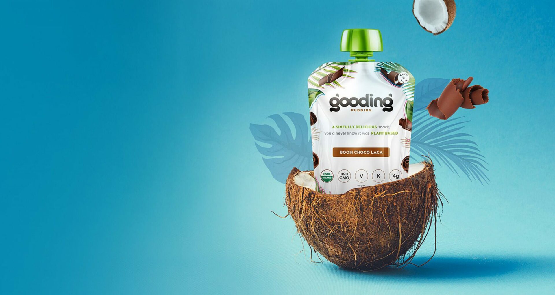
Gooding is a squeezable, plant-based pudding brand created for conscious appetites. It’s great-tasting, keto-friendly and vegan, and comes in spoon-free packaging that conserves water and plastic. In 2017, the natural foods manufacturer partnered with LANSGraphix for help carving its niche within a category so tepid, it had grown skin. What we did next turned into a tasty adventure.
WHAT WE DID
Brand Strategy
Creative Development
Shopify Website
Digital Engagement
BRAND
It’s Gooding Limited

THE BRIEF
In 2017, the natural foods manufacturer came to LANSGraphix for help carving its niche within a category so tepid, it had grown skin. What we did next turned into a tasty adventure. In this story you’ll see how we strategically named and positioned the Gooding brand for the young at heart, how we developed a snarky new voice and creative to give the brand a playful personality, and how we poised their digital strategy to challenge in a quickly-growing healthy snack segment.
THE SOLUTION
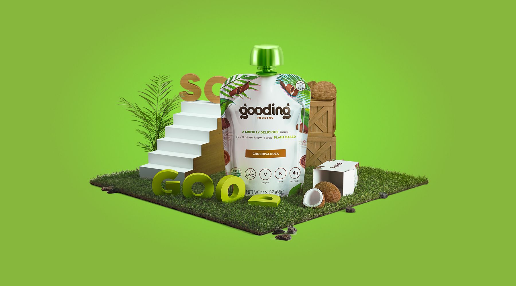
We started by identifying an audience in the healthy “Good For You” snack category. There are 75.8 million #Vegan posts on Instagram right now. And according to Plant Based News, over three million people in the UK alone made veganism their 2019 resolution. Compare this to the ever-present love humanity has for sweets, and it was obvious Gooding had a place in the snack world. The trick would be finding the right audience to connect with.There were 3 main audiences we positioned the brand to speak to: Health And Fitness Enthusiasts, Millennial Influencers and The Modern Health Conscious Parents.
WHAT’S IN A NAME?
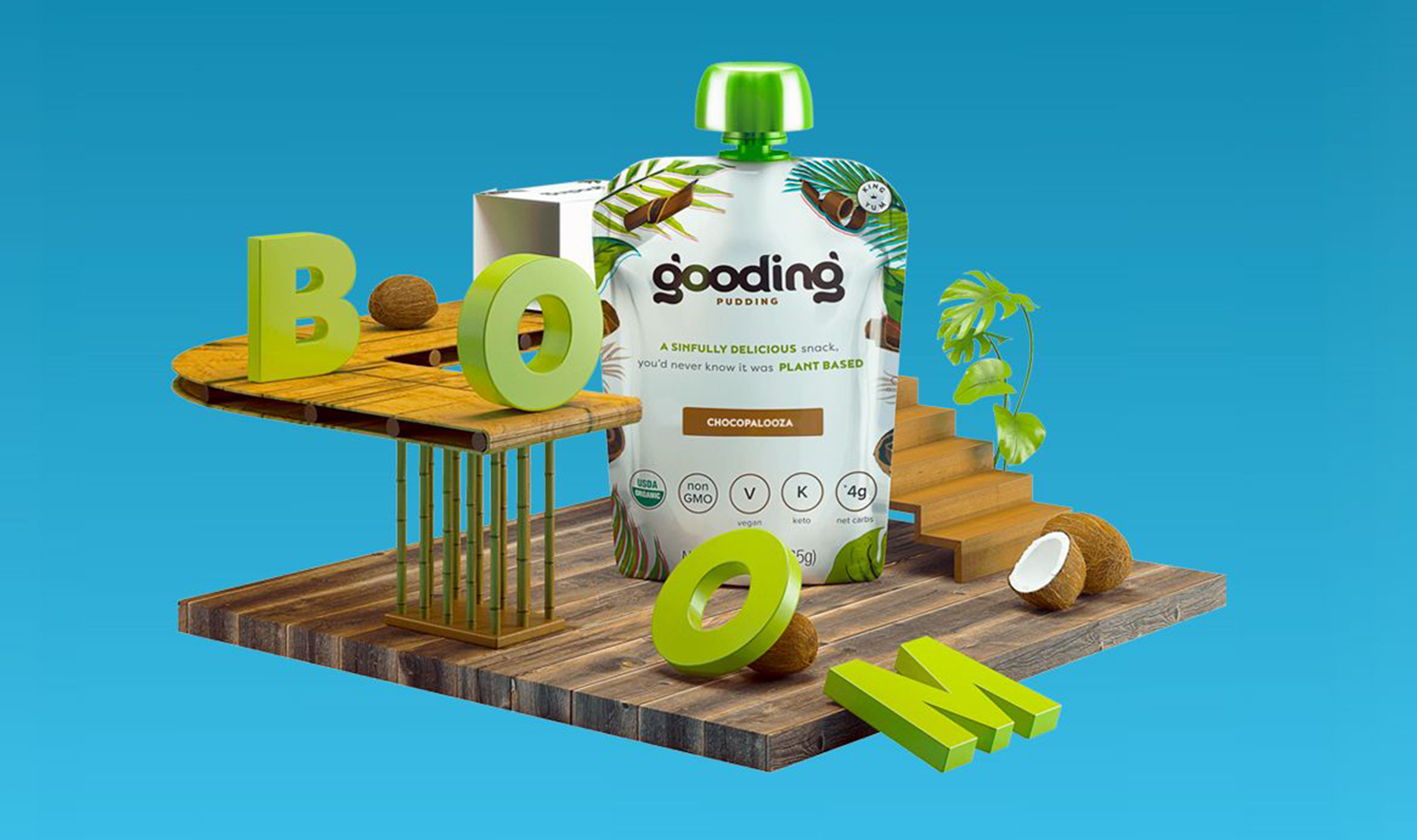
Yes, spoiler, the product ended up with the name Gooding, but the process wasn’t that simple. Or was it? The product was good-tasting (delicious actually). The product was good for you. And, it was pudding. Boom. Named. Run some paint down its forehead and hold it up like Simba. While the name for its pudding product came together quickly, Gooding’s parent company still needed an identity within the broader healthy snacks category. The company’s leaders weren’t just determined to revitalize a stale pudding segment. Their long-term vision is to reign over the entire healthy snacks category. We landed on a name that mixes the oddball spirit of the brand with the entrepreneurial spirit of its leaders.
THE RESULT
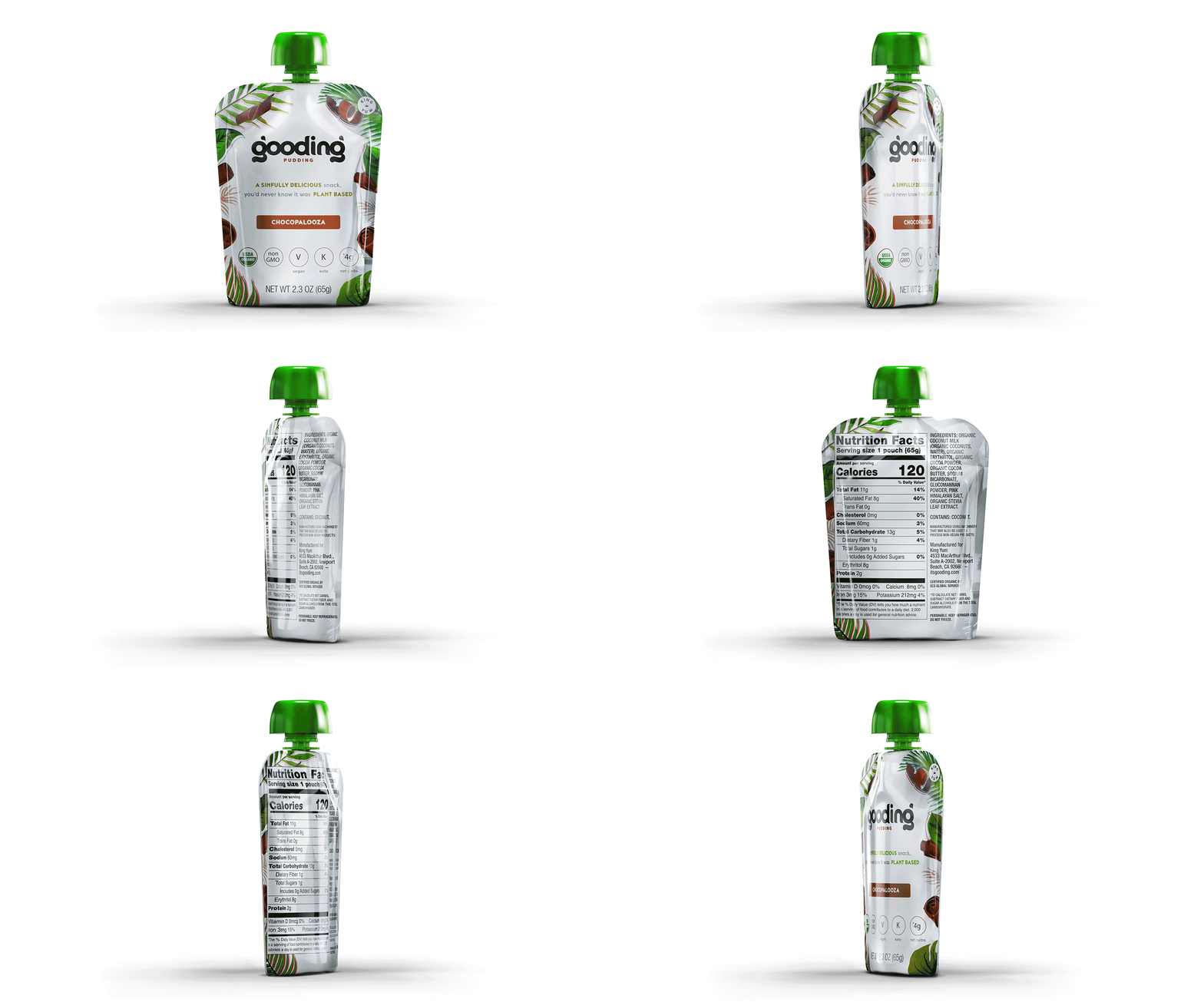
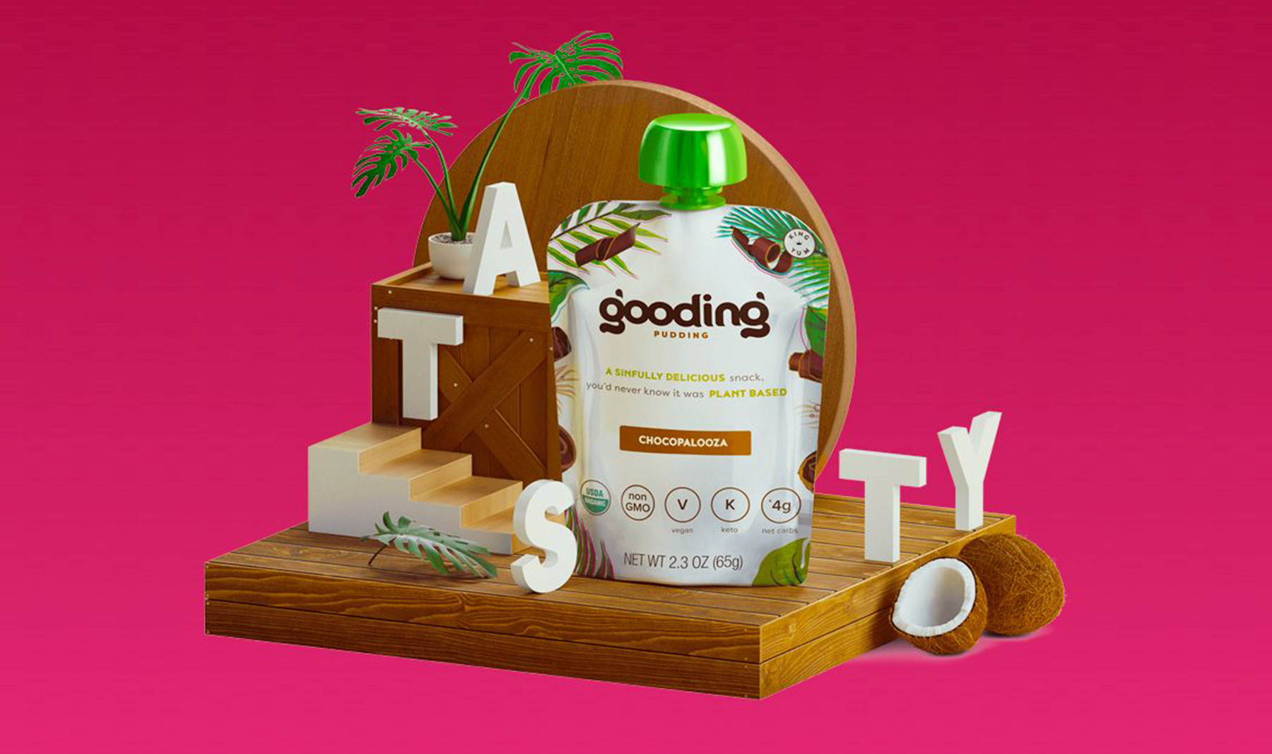
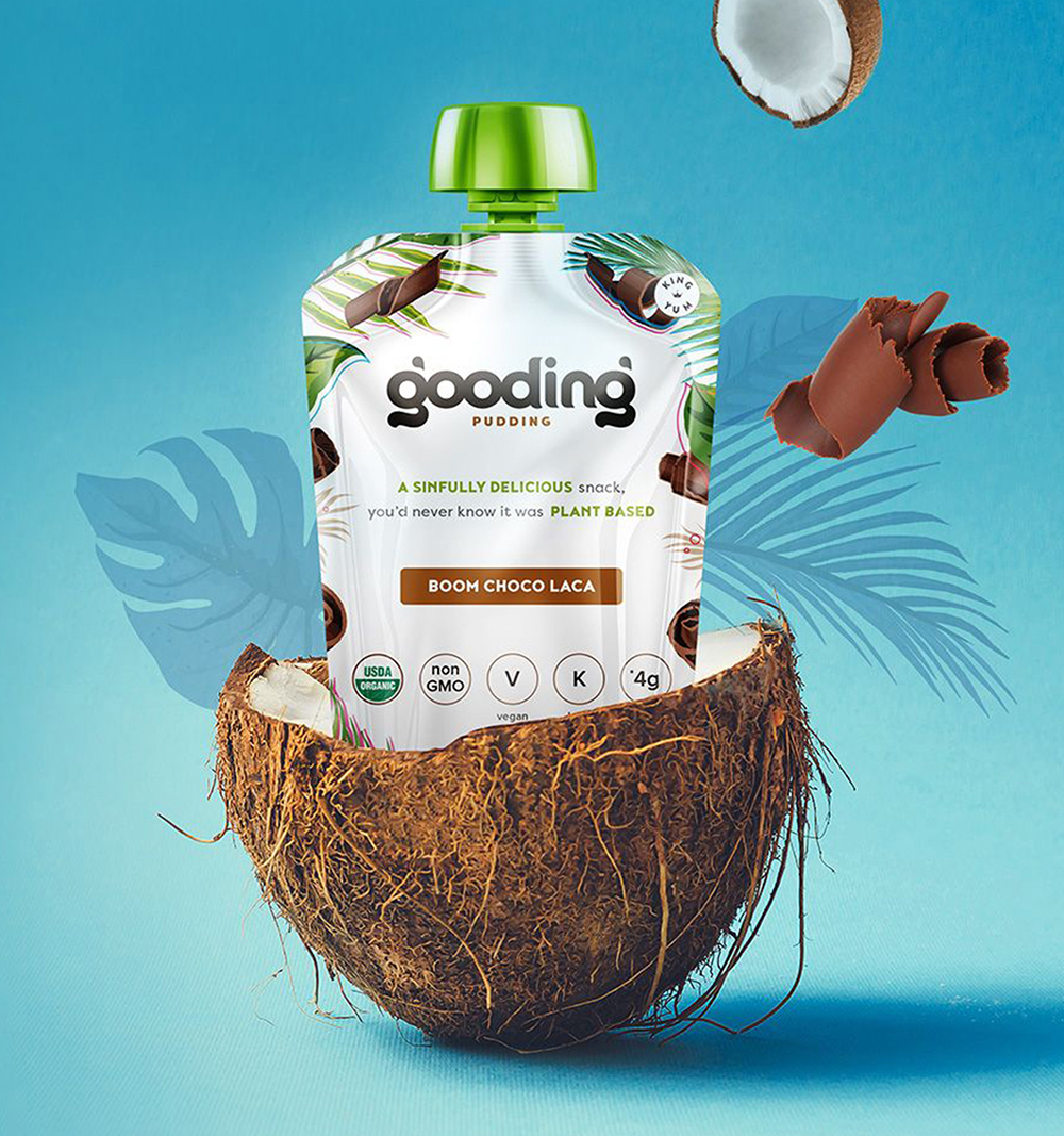
With a strong understanding of who Gooding is, LANSGraphix’s designers dug in. We designed packaging and a logo for Gooding using light colors and plenty of white space. Departing from the frenetic imagery of sugar-heavy kid’s brands, we chose natural, soft colors to help packaging stand out on grocery shelves. While a large font kept the product feel simple, natural, and welcoming.
LANSGraphix’s copywriters further had to balance a silly sense of humor with a wholesome heart, and apply that voice on its website, packaging, andsocial posts given that attitude is a huge part of Gooding’s brand. Balancing product education with a bouncy, carefree tone, Gooding’s website was also designed to enlighten and entertain. From FAQs to flavor pages, we mixed in a variety of fun design elements like floating coconuts and bubbles.
